Responsive webdesign:
friendly to mobile devices
In recent years the use of mobile devices has increased explosively and continues to grow. As more people search websites via their tablets and smartphones, your website should be mobile friendly: in other words, your website layout should be able to adapt to any screen size effortlessly. This is what responsive web design does.
To get an idea, see view of this website on your PC and compare it with the template layout on your smart phone. If you are viewing this site using your laptop or PC, then make your browser window smaller to experience the effect of responsive design.
Responsive web design ensures that your website remains user-friendly on any device.
Moreover, in the context of SEO, Google has stated that user-friendly websites with responsive design is the way to go. Today's world is the world of smartphones, tablets, and four out of five online shoppers are using mobile devices. Very good reasons to choose for a website with responsive design.

With responsive web design your website reaches over 50% more web traffic! This is an ever-growing percentage of internet users online via smartphones and tablets.

- professional quality website
- clear website structure
- unique responsive design
- template as per your logo & branding
- image gallery
- contact us module
- Google map module
- sitemap
- standard back office & CMS
- database setup
- 2 Gig bandwidth / month
- 10 email accounts per domain
- email forwards & auto-responders
- webmail
- domain reservation
- hosting 99,9% uptime!
- 24/7 support
- low maintenance cost
- maintenance *): € 13,50 /m
- price: from
€ 745 now € 545!
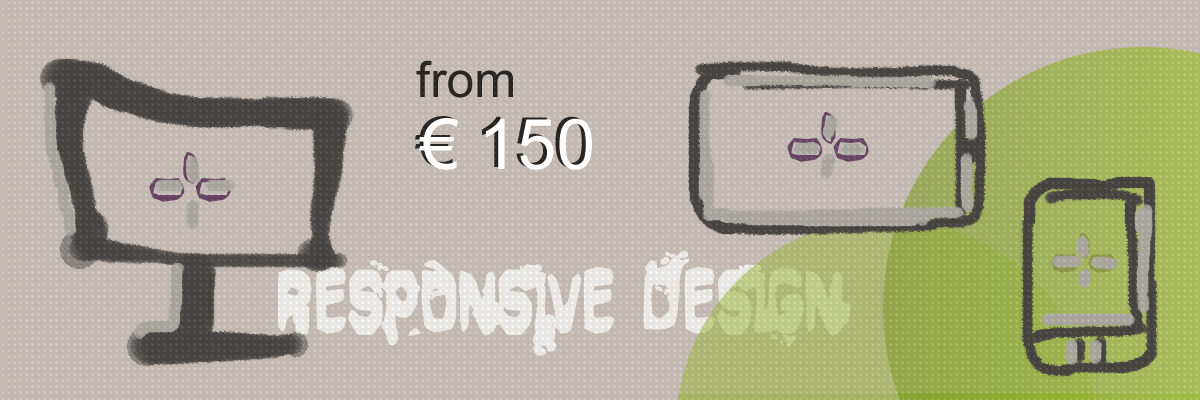
MR Websites likes to stay up-to-date with the latest trends and can offer you a discounted module Responsive Design. In case MR Websites needs to re-build an existing website responsive, the price for this depends on the amount of work. If you choose to purchase a new website with responsive design, we can offer this module for € 150 only!
Now a fully responsive website all-in-one package for € 545 only!
Contact us for a free no obligation consultation. If you want a direct answer, you can contact MR Websites via Skype from Mon - Fri between 14:00 - 20:00 hrs.
All maintenance cost *) at a glance:
TOTAL cost for ALL responsive website maintenance from € 13,50 /m
→ All website costs are explained in the MR Websites FAQ's
The following costs are for services in case ordered separately
| SERVICE |
COST |
| domain reservation |
from € 9.99 / year |
| hosting |
from € 2,99 / month |
| cPanel |
€ 9,95 / month |
| setup fee |
€ 9,99 (one time only) |
| maintenance & support |
from € 29,95 / month |

The Standard Responsive Website Package for a keen price (bespoke website can of course also be delivered with responsive web design):
- price website development one time only:
- basis: from
€ 595 now € 395!
- module responsive design now only € 150
- total maintenance costs = domain + hosting + cPanel + setup + 24/7 MR Websites support: € 13,50 /m
- this package is very complete and offers everything you need for a Website Standard + responsive design!
- no hidden extra costs!
SAVE MORE THAN € 365 PER YEAR!!!
Interested? Learn more? Contact us for a free no obligation consultation
Start with a standard website: click for more information.
Want to know more about a Tailor Made Website? Check here.
Everything on hosting, hosting packages, all website costs & MR Websites All-in-one Package? Click here.
 websites


 (00351) 966 28 44 67
 Puntegaalstraat